Color is one of the most powerful tools in interior design. It not only affects the aesthetic appeal of a room but also plays a significant role in influencing our emotions and overall mood. Understanding the principles of color psychology can help you choose the right hues for your living spaces, ultimately creating an environment that promotes positivity, relaxation, and productivity.
Understanding Color Psychology
Color psychology is the study of how colors impact human behavior and emotions. It is rooted in the idea that different colors evoke specific feelings and reactions, often unconsciously. This understanding allows interior designers to manipulate color in order to create desired atmospheres, whether it be a calming sanctuary, a vibrant workspace, or an inviting social area.
The Basics of Color Theory
Color theory provides a framework for understanding how colors relate to one another and the psychological effects they can produce. It involves categories of color, including primary colors, secondary colors, and tertiary colors.
Primary Colors: Red, blue, and yellow are considered primary colors, as they cannot be created by mixing other colors.
Secondary Colors: Secondary colors, such as green, orange, and purple, are created by mixing two primary colors together.
Tertiary Colors: Tertiary colors are formed by mixing a primary color with a secondary color, resulting in hues such as teal, magenta, and chartreuse.
The Color Wheel
The color wheel is a visual representation of colors arranged according to their relationships. It helps illustrate complementary, analogous, triadic, and monochromatic color schemes.
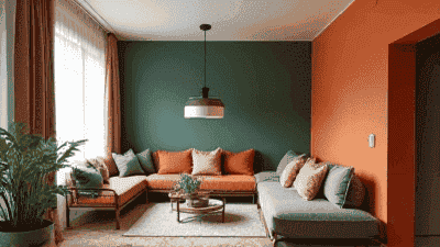
Complementary Colors: These are colors located directly opposite each other on the color wheel, such as blue and orange. Complementary colors create contrast and vibrancy.
Analogous Colors: These are colors that sit next to each other on the color wheel, such as blue, blue-green, and green. Analogous colors create harmony and a sense of unity.
Triadic Colors: This scheme consists of three colors spaced evenly around the color wheel, such as red, yellow, and blue. Triadic colors provide balance and vibrancy.
Monochromatic Colors: A monochromatic scheme involves different shades and tints of a single color, creating a cohesive and soothing look.
The Psychological Effects of Colors
Each color has unique psychological effects that can influence mood, behavior, and perception. Here, we explore several key colors and their associated feelings:
1. Red
Red is a powerful and bold color often associated with strong emotions such as passion, energy, and excitement. Its stimulating nature can increase heart rates and encourage action. However, too much red can lead to feelings of anger or aggression.
Best Uses: Red can be effectively used in spaces intended for social interaction, such as dining rooms or living areas. It sparks conversation and can enhance appetite.
Considerations: Use red in moderation to prevent overwhelming the space. Accent pieces, such as throw pillows or wall art, can introduce red without dominating the room.
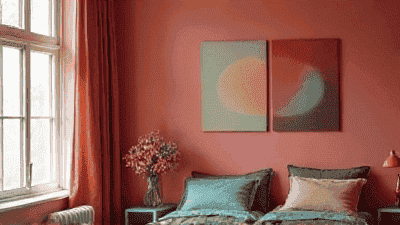
2. Blue
Blue is often regarded as a calming and serene color, associated with tranquility, stability, and reliability. It can lower blood pressure and induce feelings of peace and relaxation. Lighter shades of blue evoke feelings of clarity and spaciousness.
Best Uses: Blue works well in bedrooms, bathrooms, and home offices where relaxation and focus are essential. It is known to enhance productivity and calm the mind.
Considerations: Avoid excessively dark shades of blue, as they can lead to feelings of sadness or melancholy. Balance darker tones with lighter furnishings or textures.
3. Yellow
Yellow is the color of sunshine and happiness. It is often associated with optimism, energy, and creativity. Yellow can stimulate mental activity and inspire joyful emotions. However, too much yellow can lead to feelings of frustration or irritability.
Best Uses: Yellow is effective in kitchens, children's rooms, and creative workspaces. It can encourage conversation and creativity.
Considerations: Use yellow as an accent color rather than a main hue in larger spaces. Pair it with other warm colors to create a balanced and cheerful environment.
4. Green
Green is the color of nature, symbolizing growth, harmony, and renewal. It is known to have a calming effect and promotes feelings of tranquility and balance. The various shades of green, from soft pastels to deep earth tones, can evoke different moods.
Best Uses: Green is suitable for living rooms, offices, and bedrooms, fostering relaxation while encouraging creativity.
Considerations: To create a more vibrant atmosphere, opt for brighter or richer shades of green. Use earthy tones to create a cozy and inviting feel.
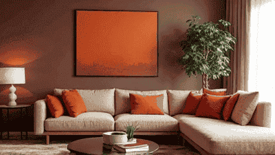
5. Orange
Orange combines the energy of red and the happiness of yellow, representing enthusiasm, creativity, and warmth. It can stimulate conversation and increase energy levels, making it a great choice for social spaces.
Best Uses: Orange is ideal for living rooms, playrooms, and dining areas, where social interaction is encouraged.
Considerations: While orange is uplifting, it can be overwhelming in excess. Use it strategically as an accent color to create warmth without overpowering the space.
6. Purple
Purple is often associated with luxury, creativity, and spirituality. It can evoke feelings of calmness and provide a sense of sophistication. Lighter shades of purple, such as lavender, promote relaxation, while deeper shades can create a sense of richness.
Best Uses: Purple works well in bedrooms, home libraries, and creative spaces, fostering a sense of imagination.
Considerations: As with other bold colors, use purple in moderation to avoid overpowering a space. Combine it with neutral tones for balance.
7. Neutrals
Neutral colors, such as white, gray, beige, and taupe, provide a versatile backdrop that allows other colors to shine. They evoke feelings of calmness and stability. Neutrals can create a timeless and chic look while offering flexibility.
Best Uses: Neutrals are suitable for any room and serve as an excellent foundation for decor elements. They can also make spaces feel larger and airier.
Considerations: To prevent neutral spaces from feeling sterile, incorporate varying textures and a few pops of color through furniture or decor.
Creating a Balanced Color Scheme
When designing your interior spaces, aim for a balanced color scheme that enhances mood without overwhelming the senses. Here are steps to create a harmonious balance:
1. Define the Purpose of Each Room
Consider the primary function of each room and how you want it to feel. For example, a calming space like a bedroom may benefit from cooler tones, while a lively kitchen may incorporate warm colors.
2. Choose a Base Color
Select a base color that reflects the atmosphere you want to create. This will be the dominating color in the room and should align with the room's purpose.
3. Incorporate Accent Colors
Choose one or two accent colors that complement your base color. These can be introduced through decor, artwork, or furniture. Accent colors energize the space while supporting the overall scheme.
4. Use Different Shades and Tints
Incorporate variations in shades (darker tones) and tints (lighter tones) of your chosen colors. This adds depth and richness, creating a sense of balance within the design.
Practical Tips for Applying Color Psychology in Interior Design
1. Test Colors in Your Space
Before committing to a color, test swatches on the walls and observe them in different lighting conditions throughout the day. Colors can appear differently depending on ambient light, so adjustments may be necessary.
2. Consider Color Combinations
Explore various color combinations to determine which resonate most with you. Utilize concepts like complementary and analogous colors to create a cohesive and engaging design.
3. Pay Attention to Lighting
Incorporate different types of lighting, such as ambient, task, and accent lighting, to fully showcase the colors in your space. Lighting can alter the perception of color, affecting mood and ambiance.
4. Think About Texture and Material
Incorporate texture and material variety into your design. Different finishes, fabrics, and surfaces can affect how colors are perceived and how they contribute to the overall atmosphere.
5. Personal Preference
Ultimately, select colors that resonate with your personal preferences and style. Interior design is a form of self-expression, and your space should reflect who you are and what makes you feel comfortable.
Conclusion
Color psychology plays a crucial role in interior design, offering insights into how colors can influence emotions and functioning within a space. By understanding the psychological effects of various colors and applying this knowledge to your design choices, you can create environments that enhance mood and well-being.
As you embark on designing your living spaces, consider the purpose of each room, the feelings you want to evoke, and the colors that resonate with your personal style. With mindful selection and application of color, you can turn your home into a place that promotes comfort, creativity, and joy.


